
When we started designing our mobile app, we began with who we were setting out to build for.
While you may think that, because Sanctum is a finance app, we’d be building for someone quite passionate and involved in finance, the opposite is actually true. We built for someone who just wants finance to exist quietly in the background of their life. That person (who we believe represents most people in the world today) may be turned off by apps that push users toward financially destructive behaviors, interrupt their days with alerts, and try to coerce them into being more financially active.
So, because we knew we were building an app for the world, not a small cohort of risk-seeking active speculators, every decision we made in the app’s design started with how it would make people feel about, and act around, their finances.
To get a better sense of how the app became what you see today on the Seeker, we caught up with @cwchanchan for the inside scoop.
Why Design Matters in a Finance App
To CW, design matters because it’s a tool to help achieve a product’s goal.
In traditional finance apps, it can sometimes function as a manipulation tool. Flashing numbers, live charts, and endless notifications create a sense of urgency that pushes users into actions they wouldn't otherwise take.
Sanctum's design does the opposite.
“The design started out more black and white, but evolved into the current more colourful version when it became clear that we wanted it to feel more fun. Its rounded corners, selectively placed bright colours, and rounded typeface is what gives it that feel.”
We’re hoping to leverage intentional design to help users build healthy, long-term habits. The app is meant to help someone feel calm and confident about their financial future, following a handful of core principles:
Calm over urgency Finance is already stressful for most people, so the last thing a good financial app should do is add to that stress.
Simple over complete More features equals more ways to lose money. We’d would rather protect our users with fewer features than implement ways to monetize their impulses.
Long-term over short-term The interface is designed to discourage the kind of short-term thinking that causes most people to underperform in markets.
Delight is not a nice-to-have An app you love opening is an app you'll use consistently. And consistency is the whole game when you're investing for the long term.
Inside the App
Let’s take a BTS look at the app, covering what you see and, more importantly, why it looks and works the way it does.
Home Page
The home screen is where users land every time they open the app. For most finance apps, this is prime real estate for driving up cortisol and pulling users into more action.
In Sanctum, the home screen is calm.
Front and center is Albus, your in-app companion, greeting you each time you open the app. Just below him, you can see exactly when your next reward is coming, and there's a clear path to deposit more SOL if you'd like.
You can also navigate to the rest of the app's main pages, and a small settings button sits in the top right for when you need it.
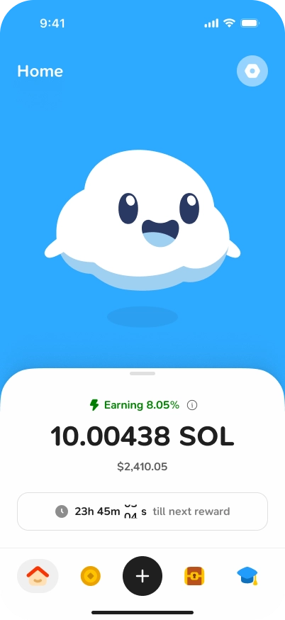
There are no live-updating charts or market news feed to pull you into a spiral. The home screen gives you a clear picture of your holdings and how they're growing, and then it steps aside.
We think that's more than enough!
“We didn’t want to make price volatility the red meat of the homepage. We just wanted users to see their cute Albus when they open the app.”
Albus
In building Sanctum’s UI, we wanted to show that the app was made by people who care about users beyond profit potential. Albus has a big role to play there as the physical embodiment of that intention.
He helps bring the financial stress down, spread delight, and help make our app feel like one you want to open.
“Our company logo is already a character on its own, so turning it into a mascot was the natural next step. People at Breakpoint 2025 really loved the plushies of our logo that we gave out; that gave us the confidence to actually turn our logo into Albus.
You'll find Albus throughout your Sanctum journey, starting with a warm welcome as you create your account. From there, he'll be present as you explore Library content, earn daily rewards, collect XP, and more!
→ Meet Albus, Your Cloud Companion
Library
Education is one of the most powerful tools for building good financial habits. So, in building our in-app library, we designed it to encourage your reading of content that will help you build fundamental investing knowledge.
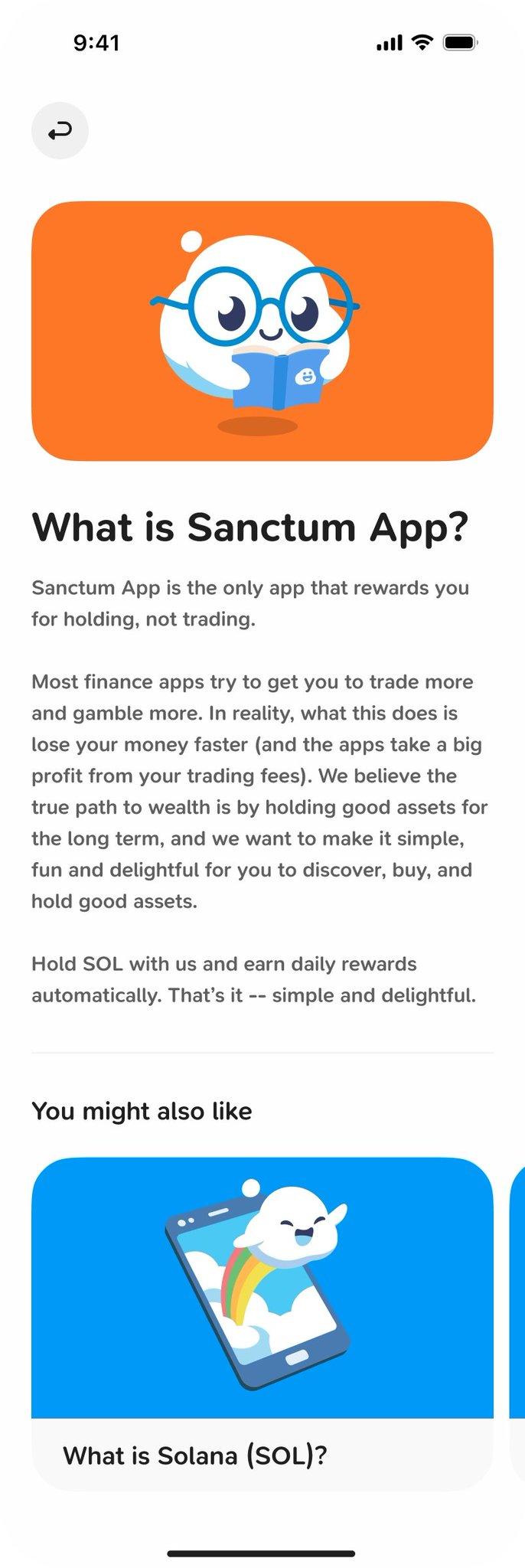
"We originally called this page ‘Learn.’ But once we decided to include app update content, it became bigger than Learn. So, we changed it to Library and have been moving with a grander vision since.”
New sections will be added as the app grows and as we find more things worth sharing. Hopefully, it'll change some lives for the better!
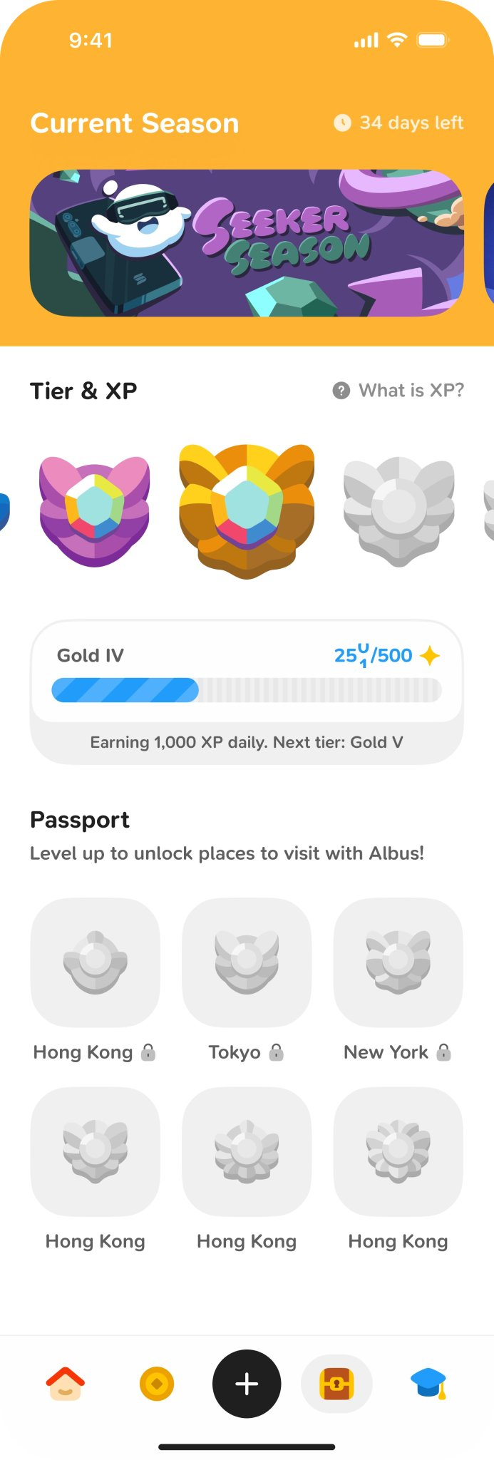
Seasons Page & XP System
With the launch of Seeker Season, we introduced our Seasons page and integrated XP system.
You can learn more about how the system works in our announcement blog.
Below, read through our XP system Q&A with CW:
Q: How did the team design the XP system? Were there any difficult decisions they had to make? any trade offs?
“The XP system was pretty straightforward, nothing extraordinarily difficult in our case. The main concern when designing the curve was finding the balance between the needs of both the low- and high-balance users. Low balance users need to still make meaningful progress at the start, but the curve cannot be too gentle such that it feels too easy for the high-balance users.”
Q: Why does XP reset but cosmetics stay -- was that always the plan, or did you try other models?
“Cosmetics should stay because once you’ve earned them, taking them back from you would feel wrong. XP resets because we want to be able to continually welcome new users in future seasons. Another model we considered was to run a global, permanent XP system, but we decided to drop that because it heavily rewards early users and punishes new users later. We also tried day streaks instead of XP. i.e., 'How many days have you held your SOL?', similar to Duolingo. But that only rewarded time, not balance. We needed a system that rewards holding more & holding longer.”
Q: Which specific games did you look at when designing this? What did you take from them, and what did you consciously reject?
“Duolingo and Brawl Stars mostly. Duolingo to study how they make something boring like education, fun. Brawl Stars for their great visuals. We also referenced our own Wonderland. Users enjoyed the XP experience from Wonderland.”
Q: Dew, Breeze, Sky, Aurora, Orbit, Nebula, Nova -- how did you arrive at that progression? Were there other naming directions you explored?
“We didn’t want something basic like bronze, silver, gold, or diamond. We paid attention to the details, including the names of the tiers. We wanted something more fun and related to the sky. Each name cannot exceed 6-7 characters, or else they will be too long to handle on the UI. The tradeoff with these names is that the progression isn’t clear, unlike gold-silver-bronze. But we think that’s an ok tradeoff to make.”
Q: What about the badges, the shapes, the colours? What was the design meant to evoke?
“FP wanted the badges to feel like Pokémon gym badges. They should look nice enough to make you want to level up and get them all! We had the main tiers (sky, aurora, etc.), and sub-tiers (sky 1, 2, 3…), so we needed to represent both in the design. The main piece represents the main tiers, and then the gems represent the sub-tiers.”
Q: A lot of gamification in apps can be negatively addictive. How did you design the rewards system to avoid that while still making it feel genuinely fun?
“It was an intentional decision that users will earn their rewards even if they don’t open their app after depositing. Despite all the gamified mechanisms, we don’t want to tie rewards to any form of periodic action that the user must take. You don’t have to come back to claim/redeem/earn your rewards daily. You can choose to engage with the games. If that’s not your cup of tea, you can simply choose to deposit, hold, and not do anything else.”
Built to Feel Different
Through Sanctum, we hope that finance starts to feel a bit different for you.
We want to show you that it doesn't have to feel like a second job, and that it most definitely doesn't have to feel like you're in an endless casino. In Sanctum, it can feel like planting a garden: something you tend calmly, that grows steadily, and that rewards you for showing up and being patient.
For us, creating that feeling has been more of a game of what to keep out of the app, as opposed to how many features we can pack into it.
And that feeling, we think, is what good financial design actually looks like.